BRAND IDENTITY AND LOGO DESIGN
KEEPING IT ORGANIC
Client
Keep it Circular
Year
12/2023
THE LOWDOWN
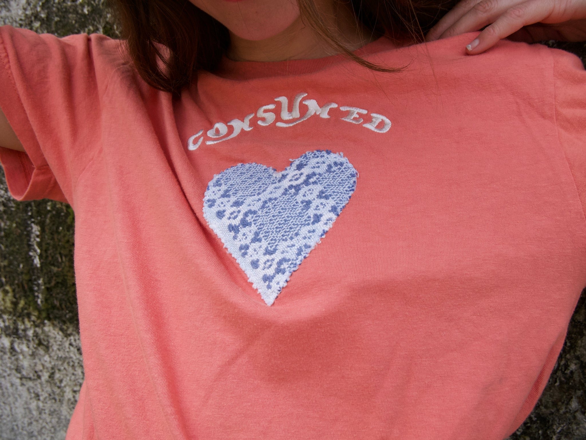
Keep it Circular aims to keep clothes out of landfills by upcycling thrifted blank t-shirts and other apparel. I created the design for their first launch a few years back, and was contacted to work with the owner to create a brand identity once they grew.
With a popular local festival coming up, they partnered with a band who would use the blank thrifted tees as base for their merch. It was finally time to solidify the KIC identity so they could tag these shirts with their logo. It was a quick turn, and tons of fun to create.
Guiding words: organic, simple, modern/hip, fun, inviting.
THE DELIVERABLE: Brand identity basics, most importantly a logo and simpler logomark.

THE ORIGINAL T-shirt design from 2022
THE ROUGH DRAFTS
Original concepts were fun and playful. The primary colors and rough letters lent more to a children’s brand than to a socially conscious brand. Some elements repurposed for the final logo, and some work great as apparel designs.


THE FIRST CONCEPT
Trendier, more symbols, keeping some organic elements intact and adding clean lines to contrast.

THE FINAL CONCEPT
Brought back the silhouette of the original concept with a more unique color palette and incorporated some of the ideas from the “Revised Concept,” elements that can be separated and still identify the brand on smaller imprint areas, like tags, as a logomark.


